


Exploring a new look
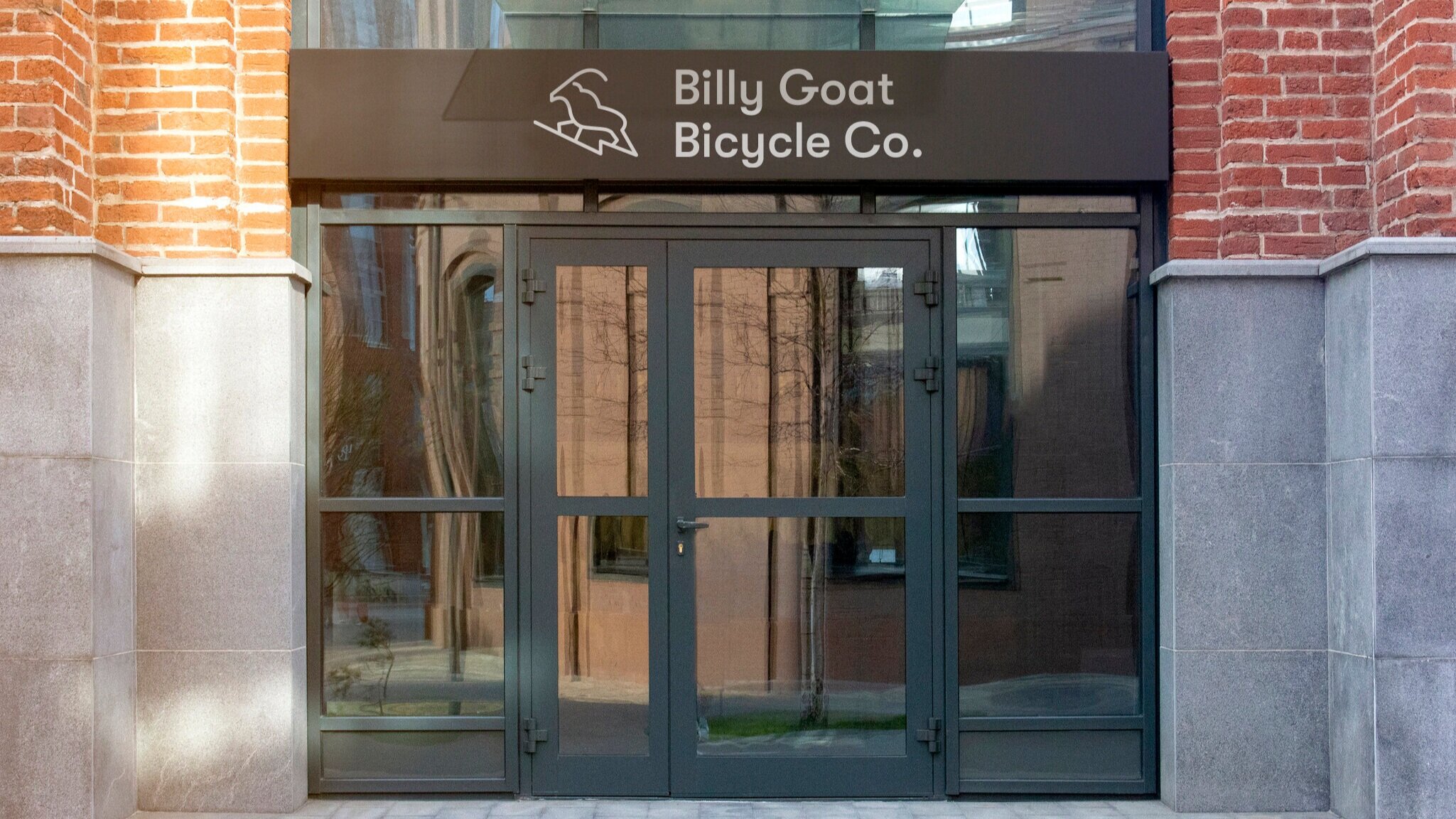
Billy Goat Bicycle’s original identity was inspired by the goats found in Sister Bay, a village located in Wisconsin where a restaurant named Al Johnson’s is found and known for having live goats grazing on their grass rooftops. With youthful memories of watching the goats in Door County, as well as remembering goat-filled hiking adventures in Switzerland, the new symbol provides more of a balanced relationship with the typography and allows for a wider array of applications for the brand. This allows for a simplistic and minimalistic feel to the brand allowing the bicycles themselves to shine.


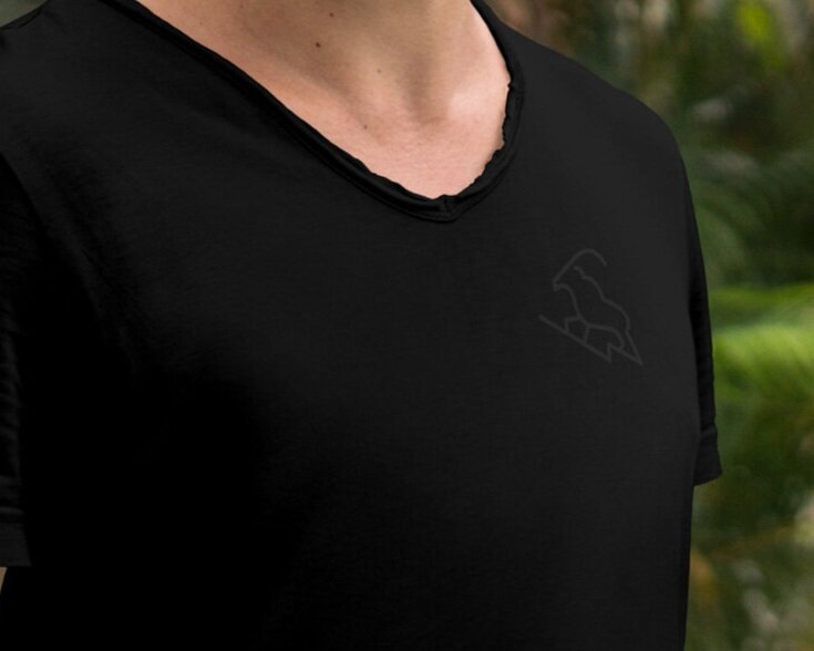
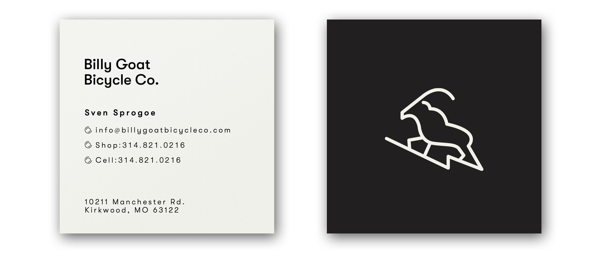
Illustration System
With the billy goat icon as a jumping-off point, a consistent illustration system was designed to be used in a myriad of situations including signage, products, and more.


Signage
Having a brick-and-mortar store in Kirkwood, MO, I developed a signage system that would help new and veteran cyclists navigate through the store with ease. Following the same iconic minimalistic look that was already established with the illustration and logo development.


Website
Billy Goat Bicycle didn’t need a complicated website, which made developing a simple landing page easy enough. This included a brief history, servicing and tune-ups, their personal bike collection, and lastly upcoming rides that they are participating in.

The Team
Art Director — Tyler Leiweke